Embrace the Jank

I’m sure you’ve noticed by now that most of my long posts are somewhat aimless streams of conscious that find their thesis partway through. Crafting an essay, editing it, and endlessly rewriting it to perfection is such a skill, and I don’t know how writers do it. Thankfully, I’m providing these words mostly as a framing device to show off my drawings.
I’ve been hard at work on Angelica and the Bear Prince for a minute, and I wanted to take the time to show you a bit more of the behind-the-scenes work that goes into the process of making a graphic novel. Then I got tripped up worrying about the very granular nature of the behind-the-scenes work.
I would stop and start work every page asking myself, “What’s an interesting piece of the process I could impart? Is this part compelling enough to screenshot and dissect?” And this actually runs counter to the way I approach making a comic because I’m pretty practical about it. I wrote this, then I sketched this, then I drew this. I don’t think about the magic behind the process because I see how it’s made, and I can confirm that whatever magic ends up on the page is brought to you by my poor fingers.
And then I realized I could plumb a little deeper and talk about my creative anxieties! It sounds dour, but I think it’s well worth a little reflection on my part. Plus, it’s fun. It’s like, I don’t know, rollerskating. Half the fun is the risk of wiping out (he said, half-wondering if he’s been roller-skating wrong this whole time).
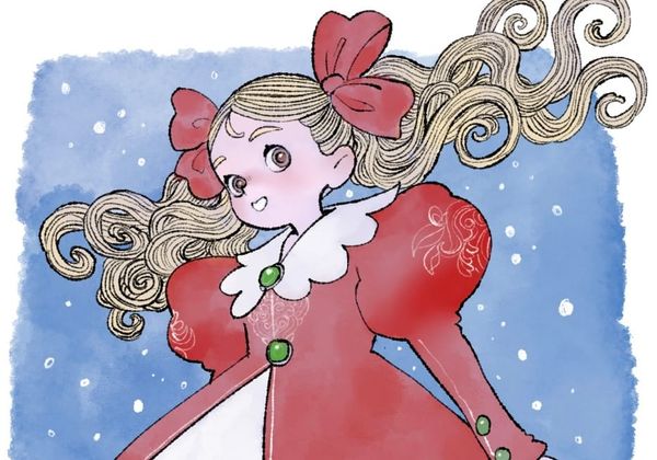
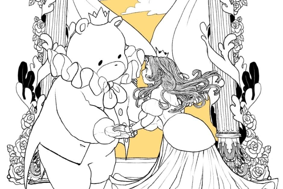
Being a creature of rules and habits, the entirety of The Magic Fish was mapped out onto pages that adhered very closely to a grid divided into nine equal panels. To my mind, it was sort of like training wheels. It was my first solo project. I wanted something firm around which I could orbit without flying off into space, and the panel composition (as well as the essay structure of the narrative) became that center of gravity. You can actually see this in the beginning pages of Angelica and the Bear Prince as well.

You can see the three tiers of the page panels, carefully subdivided. I’m aware that I tend to make comics for readers whose literary boundaries extend far beyond comics, so I cast a wide net when I do panel compositions. I prioritize legibility and clarity over dynamism. I’m sure I’ve mentioned this here before. But now I’m about two-thirds of the way through the pages, and I’m realizing that my way of drawing is different now than it was a hundred pages ago.
It started with the word balloons. I’ve been drawing every page in CSP, and I had been using the shape tools to draw those balloons. I hand-drew the tails to the word balloons, however, and I wasted so much time worrying about how I could best draw those tails so they could be perfectly aesthetically congruent with the balloons. Then after about a hundred or so pages, I realized that the word balloons felt aesthetically incongruent with the drawings. They were too smooth, too perfect.

I wanted my drawings to be lively and a little fun in its crookedness sometimes, and I figured that the word balloons needed to be part of the drawings to make it harmonious. I didn’t want the book to look like those cape comics where the artist just has to guesstimate the amount of space they need to leave for letterers to place balloons later. Those comics have the word balloons and text boxes floating over the pictures, and I want to integrate the word balloons into the whole drawing.
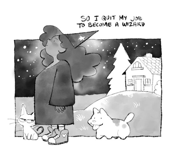
So in a fugue state, I spent a whole day redrawing every word balloon on every page I’d drawn so far. You can see it here. I don’t know how I did it, but I’m glad it happened. I felt so much better about the pages after this.

But this presented another problem. After going through every page I’d done so far, from beginning to end, I realized that my drawing style for the characters and the panels had changed pretty drastically. For starters, I had broken free of the grid, and I free-formed the paneling more frequently, which was great, but the characters also started to change.

The line quality of the drawings looks different. They maintain the texture of the noodle-hair, but the characters are a bit more lively around the edges. I adjusted my brush over and over until it felt right, and we’ve landed here. Based on what I could observe about my own process so far, I shudder to think about how different this will all look once I hit two hundred pages. And it will happen this year (I tell myself, for comfort’s sake).
I started to feel stressed about it. I’d spent all this time redrawing all those word balloons. Would I feel the need to do that with THE DRAWINGS?? Heaven forfend! That would take forever! Also, my poor editors, and RIP to my deadlines!

Fortunately, I honestly kind of love that a reader can see this. I want everyone who picks up one of my comics to understand that the jankiness is human and all the more reason to love the form. As a matter of fact, all my favorite comics do this, granted it’s over a much longer period of time.
Famously, Garfield is much this way. He changed from decade to decade, getting the Pikachu treatment where he started off as a round friend and gradually became leggier and lankier.

Kosuke Fujishima, who authored and drew one of my favorite mangas of all time, Ah! My Goddess, changes his drawing style quite a lot over time.


And readers are smart! I’m so confident that readers were able to legibly identify those characters beyond the lilt of the visual styles and even appreciate the artist’s journey they’re witnessing.
All this is to say, I am embracing the jank. I’m entirely embracing the odd ways my work will look inconsistent over a long period of time and rely on the readers to get that this is a hand-made thing. That’s why you’re here, probably. That’s why any of us are here, and, in my case, the milestones of the seasons can be read on the lines of every drawing.